

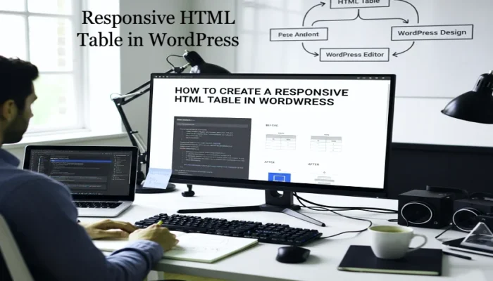
If you publish content that includes tables—pricing comparisons, feature charts, product data, schedules—you’ve likely run into this issue: your HTML table looks fine on desktop but breaks on mobile. Columns shrink, text overlaps, users need to scroll sideways, and the layout falls apart. On a site built with WordPress, this can seriously damage readability, user experience (UX) and even SEO. A responsive HTML table in WordPress adapts to different screen sizes so mobile visitors can still read and engage with your data.
In this improved guide, we’ll cover what responsive tables are, why they matter, how to implement them (both manually and via plugin), and how to make sure yours perform excellently for mobile, tablet and desktop.
What Are Responsive Tables and Why They Matter
A table on a classic desktop screen may display 8-10 columns perfectly. But when you view that same table on a phone, you may see only 2-3 columns fitting, or the table may overflow the container, making horizontal scroll inevitable. That’s not good UX.
A responsive table changes its layout when the screen width drops below a certain breakpoint. It might switch to a stacked format, enable horizontal scrolling in a container, hide less-important columns, or convert rows into cards. The goal: preserve readability, avoid cramped cells or broken design.
Why this matters for WordPress sites:
- Most web traffic today comes from mobile devices — if your table is hard to use on mobile, many visitors will bounce.
- Google uses mobile-first indexing — a page with poorly rendered tables on mobile can hamper SEO.
- a hard table to read impacts credibility — for blogs, business sites or e-commerce, clarity matters.
In short: if your table isn’t responsive, you’re risking a major chunk of your audience and search visibility.
Two Approaches: Manual vs Plugin for Responsive Tables
On a WordPress site you essentially have two routes for implementing a responsive HTML table in WordPress: one is manual (HTML + CSS) and the other uses a plugin to handle the responsiveness automatically. Each has trade-offs.
Manual Approach (HTML + CSS)
Ideal if you have only a few tables, you’re comfortable with editing CSS, and you want lightweight markup with minimal overhead.
Steps at a glance:
- Insert a clean HTML table using <table>, <thead>, <tbody>, <th>, <td>.
- Use CSS media queries to detect smaller viewports and change layout (for example: hide <thead>, display td blocks stacked vertically, or add horizontal scroll).
- Test across devices and ensure that even when the screen is narrow, the table remains readable and usable.
Pros: No plugin overhead; full control; minimal extra scripts.
Cons: More work; requires CSS skill; each new table may need adjustment.
Plugin Approach
If you have many tables, large datasets, frequently update them, or prefer easier maintenance, a WordPress table plugin is the better choice.
Using a plugin, you can:
- Create tables via drag & drop or import from CSV/Excel.
- Enable built-in responsive modes (scrolling, stacking, hiding columns).
- Preview how the table looks on desktop, tablet, mobile.
- Add extra features (filtering, sorting, pagination).
Pros: Faster to set up; better for complex data; less manual coding.
Cons: Extra plugin weight; some may slow down performance; less granular control.
Key Responsive Table Behaviors to Consider
When you build a responsive HTML table in WordPress, consider how it behaves on smaller screens:
- Will it stack (each row becomes blocks)?
- Will it allow horizontal scrolling within the table container?
- Will some columns be hidden or collapsed on mobile to simplify the layout?
- Are the table’s header labels still readable and associated with their data?
- Is the table’s width managed so it does not overflow its container or break the page width?
Choosing the right behavior depends on your content. A simple comparison of three services might stack beautifully on mobile, but a large dataset with many columns might be better served by a horizontal scroll.
Best Practices for Building Responsive Tables in WordPress
Here are practical tips to ensure your tables look great and function well:
- Use semantic markup: include <thead> for header rows and <tbody> for cell rows. This helps CSS targeting and improves accessibility.
- Keep column labels short and clear: on smaller screens long headings squeeze badly.
- Limit the number of columns if mobile readability is critical. Or if many columns are necessary, plan to hide lesser ones on mobile.
- Decide on a breakpoint (for example 600px or 700px) where the layout changes for mobile.
- Test on real devices and use browser simulators to preview mobile and tablet widths.
- If using a plugin, ensure you select a responsive mode that matches your content (stack, scroll, hide) and test each table separately.
- Check that the table doesn’t cause horizontal overflow of the page container or push site margins out. That ruins layout.
- Keep performance in mind: large tables + heavy scripts + plugins = slower page load. Optimize what you can.
- Consider the accessibility of your table: screen-reader friendly markup matters for users and for SEO.
When to Use a Responsive Table vs Alternative Layout
Tables are great for structured data: product comparisons, pricing tiers, feature sets, schedules, etc. But sometimes a table may not be the best choice—especially on mobile when the design gets too crowded.
Ask yourself:
- Will a bulleted list or cards display the information as clearly on mobile?
- Is the data so rich (many columns, images, long descriptions) that a table will become unreadable?
- How often will you update the table? A plugin may make updates easier.
If your site uses a table occasionally and the data is simple, manual approach is sufficient. If you have complex tables, many pages with tables, or frequent updates, use a plugin.
Choosing the Right Plugin for Responsive Tables
If you decide to use a plugin, here are criteria to pick one:
- Responsive modes (stacking, hiding columns, horizontal scroll)
- Mobile/tablet preview and breakpoints
- Import/export support (CSV, Excel, Google Sheets)
- Styling options that match your theme
- Performance: minimal front-end scripts, good reviews on speed
- Maintenance and support: updated regularly, compatible with the latest WordPress and themes
Many popular options exist. Choose one that fits your use-case and budget.
Testing and Publishing Your Responsive Table
Once your table is ready, follow these steps:
- Preview in WordPress – Use the Gutenberg preview, switching between desktop/tablet/mobile icons.
- Test on a real smartphone – Sometimes simulators differ from real devices.
- Check landscape mode – Mobile screens in landscape can still behave unexpectedly.
- Use browser dev tools – Set viewport width to typical breakpoints (360 px, 768 px) and verify layout.
- Ensure no overflow – Your table should fit within the content container; it should not cause horizontal scroll of the entire page.
- Check accessibility – Use a screen reader or accessibility inspector to ensure table markup is clear.
- Measure performance – If you used a plugin, check page load times, especially on mobile networks.
Only after this testing should you publish the page.
Real-World Scenario: When Tables Fail and How Responsive Fixes Them
Imagine you run a site comparing hosting plans and you insert a table with five columns: Plan Name, Price, Storage, Bandwidth, and Support. On the desktop, it looks fine. On mobile, however, the “Bandwidth” column gets squeezed to a tiny width, “Support” wraps into multiple lines, and the user must scroll horizontally. The experience is poor—many visitors leave.
By converting this into a responsive HTML table in WordPress, you could implement one of two approaches: either hide the “Bandwidth” column on mobile (if it’s less critical) or stack the table so each plan appears as a vertical card with key details only, and other details accessible via expand/collapse. The mobile visitor sees clean, readable information and stays longer. Engagement improves, bounce lowers, and you’ve saved a reader.
That kind of UX improvement is the real driving force behind responsive tables—not just getting it to “look” right, but making it usable.
Summary
Creating a responsive HTML table in WordPress is about more than just adding <table> markup. It’s about ensuring your data remains readable, usable, and accessible on any device. Whether you go the manual route (HTML + CSS) or use a table plugin, the key is planning your data, choosing the right responsive behavior, testing it thoroughly, and keeping performance in mind.
If you implement this correctly, your tables will look professional, engage mobile visitors, boost readability, help SEO, and enhance your site’s credibility. In a world where mobile usage is the norm rather than the exception, delivering strong responsive tables is a small but powerful way to elevate your website.