

When a user signs up for a SaaS platform, the first meaningful interaction often happens on the SaaS Email Confirmation Page. This page does much more than verify an email address. It sets the tone for trust, usability, and professionalism. A well-designed confirmation page reassures users that their account is secure and guides them smoothly toward the next step of onboarding. Clean design, intuitive UX, and a clear CTA can significantly influence whether users continue exploring the product or drop off. In this guide, we’ll explore proven SaaS Email Confirmation Page best practices, focusing on design, user experience, and conversion-focused CTA strategies that help turn new sign-ups into active users.
What is the SaaS Email Confirmation Page?
When a user creates an account or signs up on the SaaS platform, the system notifies them an email for confirmation. When you click on the link given in the email, the page that opens SaaS email confirmation page. This page confirms that the user’s email address is valid and has been confirmed. This step is important for safety to avoid false registration and spam. In addition, this page is part of the onboarding process, where the user gets the next step, such as “Go to the Dashboard” or “Start Your Free Test”.
Why is an email confirmation page important for SaaS platforms?
In every SaaS platform email confirmation page holds great importance because it helps verify that the person signing up is a real user. During the sign-up process, a confirmation link is sent to the user’s registered email address. When the user clicks on that link, it redirects them to a specific page — this is known as the SaaS Email Confirmation Page. Though the process seems simple, it plays a big role in maintaining the integrity of the platform. It blocks fake sign-ups, filters out spam accounts, and significantly boosts the overall quality and reliability of user data.
This page builds trust, and the user onboarding experience also looks professional. Many SaaS startups and developers easily integrate this feature into their platform by downloading the online SaaS email confirmation page download. This may seem like a small thing, but it is very valuable for the security and user experience of the platform.
Common Mistakes to Avoid on a SaaS Email Confirmation Page
Many SaaS platforms underestimate the impact of a poorly optimized email confirmation page. One common mistake is cluttered design. When users land on the page, they want instant clarity that their email has been verified. Too much text, ads, or unrelated links can confuse them. Another major issue is the absence of a clear CTA. If users don’t know what to do next, they may abandon the onboarding process altogether.
Slow loading speed is another frequent problem. Since users often open confirmation emails on mobile devices, a slow or non-responsive page creates frustration. Generic messaging such as “Success” without context also reduces trust. Users want reassurance, not ambiguity. Lastly, failing to align the page design with brand identity can make the experience feel disconnected. Avoiding these mistakes helps create a seamless, trustworthy confirmation experience that keeps users engaged from the very first step.
SaaS Email Marketing and the Role of the Confirmation Page

The first step of SaaS email marketing begins with user email confirmation. When a new user signs up, the first email that goes into their inbox is the confirmation email. When the link inside this email is clicked, the user lands on the Email Confirmation Page.
This page is not just a verification signal; it is the first touchpoint of the SaaS email marketing funnel. On this page, you can start engagement with a short welcome message, product intro, or “Next Step” CTA.
If your confirmation page is well-designed and purpose-driven, user onboarding becomes smooth. This builds trust and forms a strong base for your email marketing strategy. A good start means more opens, clicks and conversions in future campaigns.
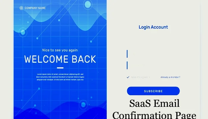
How do you design a high-converting SaaS email confirmation page?
A clean, simple confirmation page builds trust. Use brand colors, clear fonts, and remove distractions so users instantly know their email is verified. This small step improves onboarding and leaves a strong, professional first impression.
The second step is a strong CTA (Call-to-Action) — such as “Go to Dashboard”, “Start Exploring”, or “Complete Profile”. This makes the user immediately feel motivated to take the next step.
You can also add animation or a success icon so that the page is engaging. Mobile responsiveness is also important, since most users open emails from their phones.
If you need inspiration, you can check out the SaaS email confirmation page sample for a ready reference. It will give you a visual idea of how the layout and elements are smartly arranged for better conversion.
How a Well-Optimized Confirmation Page Improves SaaS User Retention
A well-optimized SaaS Email Confirmation Page plays a direct role in improving user retention. This page acts as a bridge between signup and product usage. When users clearly understand that their email is verified and see a logical next step, they are more likely to continue their journey. A friendly message combined with a clear CTA reduces hesitation and builds confidence in the platform.
Additionally, this page can subtly introduce product value. A short line highlighting a key feature or benefit helps users feel excited about what comes next. Consistent branding, fast load times, and mobile responsiveness further enhance trust. When users feel guided instead of lost, they engage faster and drop off less. Over time, these small UX improvements compound into higher activation rates, better retention, and stronger long-term relationships with users.
What’s a good CTA for a SaaS email confirmation page?
Telling a user what to do after their email is successfully verified is the job of a CTA (Call-to-Action). A strong CTA encourages the user to take the next step immediately.
The CTA on a SaaS email confirmation page should be simple, clear, and action-oriented. For example:
- “Go to Dashboard” – when the user’s account has been activated.
- “Start Your Free Trial” – if there is a trial offer after onboarding.
- “Set Up Your Profile” – when the first step is to complete user info.
- “Explore Features” – when you want to take users inside the product.
In a good SaaS email confirmation page example, you’ll see that the CTA is visually prominent, is in the form of a button, and gives clear direction. Effective CTAs increase engagement and reduce clicks.
What’s the difference between an email confirmation page and a success page?
SaaS platforms use several types of pages during the onboarding journey, of which two are important: the Email Confirmation Page and Success Page. Both have different purposes and different timings.
This Confirmation Page appears after the user has verified their email. Its main goal is to build trust and explain the next step.
The Success Page appears after the user completes an action, such as signing up, payment, or profile. This page shows appreciation and guides to the next stage.
Difference Between Email Confirmation Page and Success Page
| Feature | Email Confirmation Page | Success Page |
| Purpose | Provide confirmation after email verification | Showing Gratitude When an Action is Complete |
| Timing | After clicking the email link | After Signup, Payment or Form Submission |
| Main Message | “Your email has been verified successfully” | “Thank you! Your signup/payment is successful” |
| Next Step CTA | “Go to Dashboard” / “Start Free Trial” | “Explore Features” / “Manage Your Account” |
| Usage in SaaS Email Flow | First step in SaaS email marketing | Last step of a specific user action |
A simple way where the buyer journey starts for SAAS put the email confirmation page directly, and the success page completes the step with celebration. Overall, user experiences in shaping both play key roles.
Conclusion
A good confirmation page keeps things simple and easy to follow. Once a user confirms their email, they should be greeted with a clean design and a clear call-to-action that points them to what comes next. The UX (User Experience) needs to be smooth so that the user is not confused. The message should be short and clear, like “Thank you for confirming your email.” Mobile responsive design is also important because most users today are active on phones. A good confirmation page increases trust in the platform and makes user onboarding easy. Keeping these tips in mind is beneficial for every SaaS business.